Designing User Flows & SaaS Product Experiences
UI Design
Design Systems
Mobile Design
User Research
The Problem
How can I improve Bopsidy’s web and mobile experience to promote user acquisition & retention?
*Bopsidy is a professional platform that empowers dancers and other creatives to promote themselves and find professional opportunities.
The Tasks
Redesign the account creation user flow
Design a service landing page for high-ticket events
Create a scalable and systematized design library (typography, color styles, components, etc.)
The
Design Overview
My Role
I was the lead UX Designer on a small cross-functional product team and collaborated closely with our developers and management. My main responsibility was redesigning the company’s onboarding process.
Bopsidy’s design work was split between myself and one other designer as individual projects. As a result, the work I did for Bopsidy was individual, creating mock-ups, and prototypes, as well as seeking feedback where applicable. Because of this I also collaborated closely with management and our end developers to implement my designs and perform quality assurance.

Understanding My User’s Needs
By evaluating existing user data, I identified the three main types of users Bopsidy was serving: professional dancers, recruitment organizations, and casual dancers. I documented the unique wants, needs, and pain points of these users to inform my designs. Through affinity diagramming, I identified the themes of personalization and efficiency -being able to quickly and easily showcase their unique brand- as the main priorities for these users
Although Bopsidy serves a broader array of creatives, I focused on this subset of people because they represented the majority of active users and were the most promising from a business perspective.
Task 1
Redesign the account creation process
UX Research
UI Design
Figma
Adobe Creative Suite
Agile Development
Wireframing
Prototyping
Design Systems
Starting from a Sketch
This is the experience that Bopsidy had at the time of my joining the team. Use the arrows to the left/right to navigate through the experience.
Understanding Business Needs
As one of the first things users encounter, I knew it was crucial to communicate Bopsidy’s value (service, brand identity, etc) without making the process too long and demanding. As a result, my top priorities were being concise and intuitive.
However, I also saw opportunities to learn more useful information about their users in this process (who they are, and their motivations for using the service) as well as create a more seamless transition after onboarding.
The New Onboarding
My redesigned onboarding introduced the concept of a responsive experience depending on the type of user an individual identifies themselves as [dancer, recruiter, etc.] as well as a final step that prompts them to add basic content to their profile. Introducing UI elements such as collapsable cards allowed the experience to feel more digestible and intuitive while using different copy also made it feel more personal. From a business perspective, these additions were made so that Bopsidy could also have higher visibility of its users and identify areas of growth for its service.
Internal Feedback and Iteration
To test and iterate the early wireframes / mockups of my designs, I performed semi-structured concept testing with my team members, some of whom came from professional dance backgrounds.
These sessions were particularly helpful in contextualizing my designs with a business perspective. An example of this was working within the constraints of Bopsidy’s current services —account creation and event creation-- while maintaining scalability growth —monetizing large events and ticketing--.
Creating a Standardized Design System
Before I joined the team, there had never been a staff designer, so a large portion of my early work was spent creating a standardized UI Design system. My intention was not only to make my designs consistent and scalable across platforms but to also make the conversation between design and development easier.
To achieve this I worked in Figma to create auto layouts and systems of reusable components / variants. This not only made state management easier but allowed me to quickly iterate on designs during internal reviews with management and our front-end developer.
Creating an Intentional Mobile Experience
Instead of developing a separate app, the team decided it would be best for me to simply redesign the current web app experience.
This meant considering aspects such as smaller screens, tap/swipe interaction, and ergonomic mapping as well as how to approach the genre selection screens. This part of the experience was particularly interesting due to the amount of data being displayed and needing to accommodate many different interactions while not overwhelming the user.
I experimented with a few different layouts (see below) for this section of the design, however discussions with management ultimately led to the prioritization of users being able to see the full breadth and diversity of genres Bopsidy had to offer
As a result, I implemented a landing page that allowed users to choose their method of genre selection and thus a user flow that was more branching
CAROSEL
(+) playful
(+) conserves space
(-) limited display
(-) icons make cards relatively inflexible
(-) too many levels of interaction
LIST
(+) simple
(+) consistent with previous screens
(-) limited display
(-) small cards = low affordance
LANDING PAGE
(+) displays all genre options
(+) flexible simplicity
(-) complex interactions
(-) makes user flow non-linear
While the design direction I ultimately chose also had its drawbacks, such as slightly deviating from the flow of the initial steps of the onboarding, it aligned with our (the product team’s) main priority for the experience: showcasing that Bopsidy was a diverse place for dancers.
Task 2
Design a product landing page
Graphic Design
Marketing & Communications
Information Hierarchy
Figma
Adobe Creative Suite
Wireframing
Prototyping
Starting from a Sketch
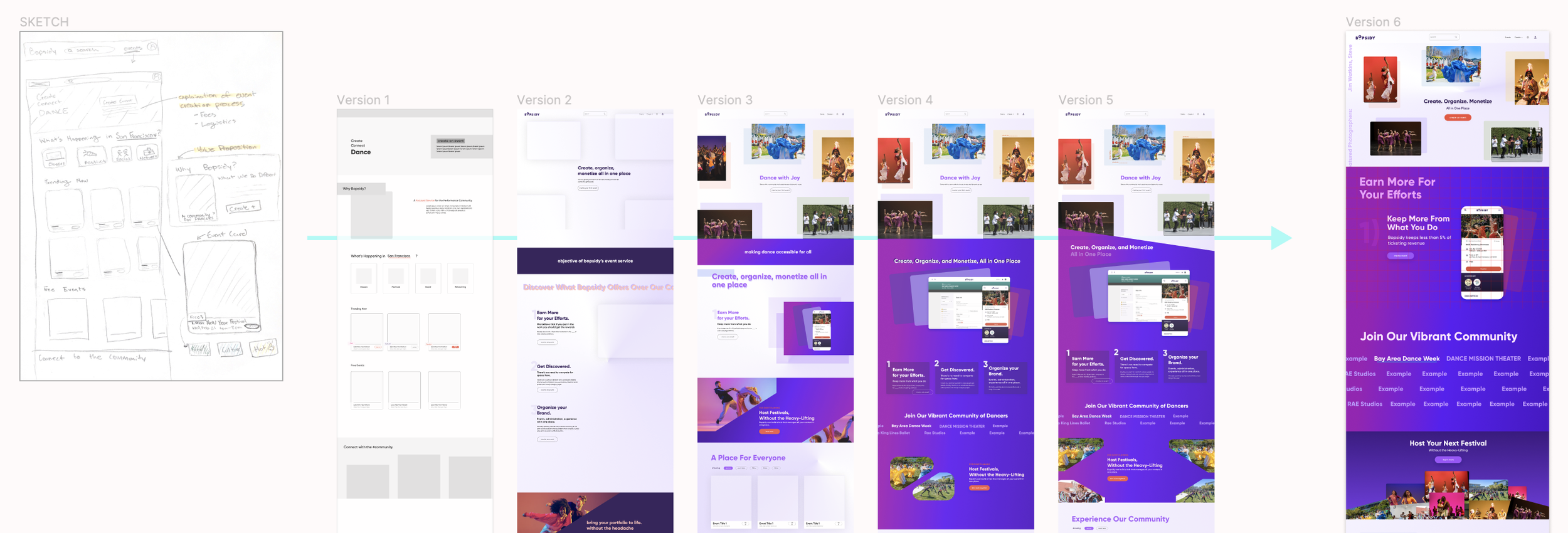
At the time, Bopsidy was also in the process of launching another, high-ticket service geared at large event ticketing. To accommodate this growth, I was asked to design a new page of the web/mobile experience advertising this service. Below is the high-level progression of this process from sketch to final design

In addition to my UX Design process, this project also challenged me to don a graphic design and marketing hat. Examples of this work included writing targeted and compelling copy as well as creating my own motion graphics in Adobe Illustrator and Adobe After Effects.
Leading Cross-Functional Design Critiques
To drive iteration, I followed an agile design/sprint approach which involved leading design critique sessions with both product management and engineering. Meeting with the engineers was especially important to my process to ensure I got early and transparent feedback on the feasibility of my designs.
I primarily used concept testing and A/B testing methods forms of qualitative analysis.
Mobile Prototyping & Microanimations
Compared to the account creation flow which was relatively straightforward and driven by tap/swipe interactions, the landing page had many more moving parts (e.g. sticky elements, informational graphics, and CTA banners) I wanted to take into account when thinking about how the user would swipe through.
My Guiding Thoughts 💭
“How can I keep the value of our service clear and interesting?”
“How can I use copy as little and as effectively as possible?”


